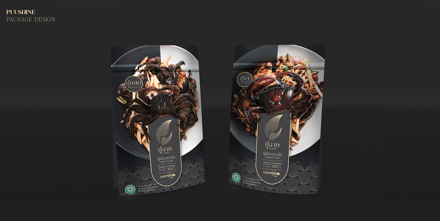
“PUUSHINE” is a combination of two words. “PU” in Thai means crab and “SHINE” means radiation. It is a sterilised preserved salted crab brand that applies radiation
to the end products to ensure hygiene, safety and longer shelf life. It also cuts down
on the amount of sodium to adjust to the healthier eating trend.

In terms of the design, the brand wants the package to have a high-end look with a graphic that represents its hygiene but still invites appetite. Black with a gold accent is used together with a traditional Thai pattern to all in all create a sense of luxury. The crab which is the brand identity is made into a logo and background pattern. The picture of the actual crab is being accentuated against a picture of a recipe that calls for preserved salted crab as an ingredient.


